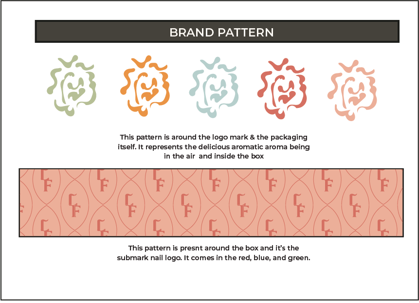
This is the brand identity of a company called Lady Fingers. They make delicious and packaged finger food that is distributed for women only. This is a company that is owned by women and the goal of the brand is to serve women healthy snacks. I was tasked with creating a delivery box, the brand’s aesthetic, and a logo that helps the women relaunch the new rebrand. Below is the brand identity itself.


Box Design
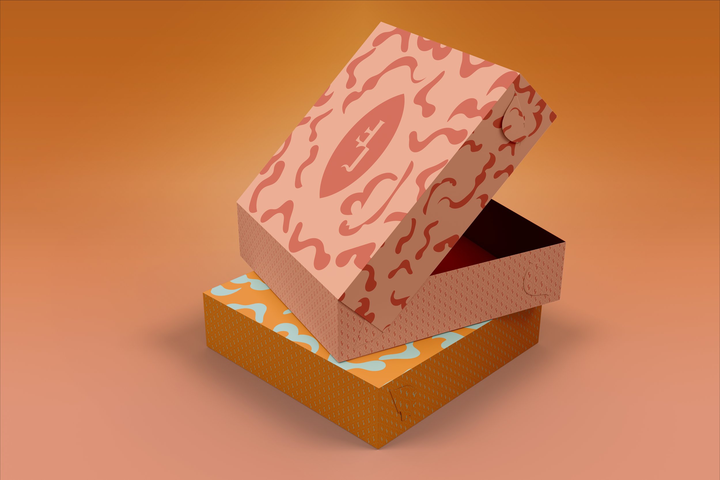
Below is the box design. This is in the color of pink and red. For the design I wanted to do something fun and inviting so on the top of the box it has the nail-shaped logo and the brand pattern flowing around it. The front part of the box has the quote “CHOW DOWN IN 3...2…1” as a way for the consumer to gain excitement while opening the box.
At the bottom of the box holds the website for the brand and another fun phrase “Don’t break a nail while eating!”. Around the quote and website is the other brand pattern of the nail logo and it’s also on the sides as well.

Final product and mockup of the box.